Guides
How to Add a Natural Shadow to a Transparent PNG
A cut-out PNG has no shadow of its own. Drop it onto a background and it can look pasted on, floating a few millimetres above the page. A shadow is what tells the eye that the object is sitting on a surface, and getting it right is usually the difference between a layout that looks photographed and one that looks assembled.
This guide covers the three kinds of shadow that matter for product and object cut-outs, and how to make each one in Canva and Photoshop.
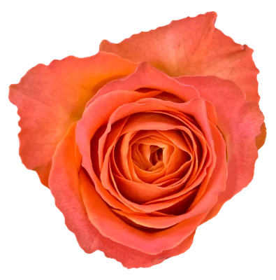
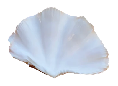
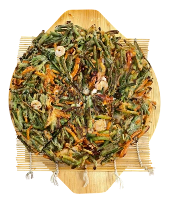
Three kinds of shadow
Drop shadow
A soft, offset copy of the object’s outline behind it. It suggests the object is lifted slightly off the surface, like a flower lying on paper or a sticker on a card. It is the quickest to add and works for most flat layouts.
Contact shadow
A small, dark, very soft patch right where the object touches the surface. Without it, bowls, fruit and shells seem to hover. With it, they sit. For food and anything with weight, this is the shadow that matters most.
Cast shadow
The longer shape the object throws across the surface away from the light. It adds drama and a strong sense of light direction, but it takes the most care: if the angle disagrees with the lighting in the photo itself, the eye notices at once.
In Canva
Select the PNG, choose Edit, then open Shadows under effects. The Drop preset follows the cut-out’s outline rather than the image’s rectangle, which is exactly what you want. Start by lowering the transparency and raising the blur well beyond the defaults; most shadows look better softer and lighter than first expected. Keep the offset small for objects lying flat.
For a contact shadow, draw an ellipse in a dark color under the object, blur it if your plan offers that, or simply set its transparency low, and place it so that only its edge peeks out from under the object.
In Photoshop
Drop shadow with a layer style
Double-click the PNG layer and choose Drop Shadow. Leave the blend mode on Multiply, then try an opacity of 25–40%, a small distance, and a size large enough that the edge is soft. Set the angle to match where the light comes from in the photo.
Contact shadow by hand
Add a new layer under the object. With a large, soft black brush at low opacity, paint a thin oval where the object meets the surface, then set the layer to Multiply and lower its opacity until it barely shows. Build it up in a couple of passes rather than one heavy stroke.
Cast shadow from the object itself
- Duplicate the PNG layer and move the copy below the original.
- Lock its transparent pixels and fill it with black, so you have a silhouette.
- Use Edit → Transform → Distort to lay the silhouette down along the surface, away from the light.
- Unlock it, apply a Gaussian Blur, and lower the opacity. Fade the far end with a layer mask: real shadows get softer and lighter as they get longer.
Rules that make shadows convincing
- One light, one direction. Every object in a layout should cast its shadow the same way. Look at the highlights in the photo and put the shadow on the opposite side.
- Softer than you think. Hard, dark shadows read as clip art. Daylight and window light make soft edges.
- Not pure black. On a colored background, a shadow in a darker shade of that background looks more natural than grey or black.
- Closer means darker and sharper. The shadow is strongest right under the object and fades with distance.
Because every PNG Heaven image is a real photograph, the light on the object is already real. Match your shadow to it and the cut-out will sit in your design as if it had been photographed there.